Inside Look: Measuring Developer Productivity and Happiness at LinkedIn
April 4, 2023
Authors:Viktoras Truchanovicius and Selina Zhang
At LinkedIn, developer productivity and happiness has always been a priority. It is critical for our engineering leaders to understand how efficiently and effectively their teams are operating to continuously deliver value-added features for our members and build an industry-leading engineering culture.
Over the years we’ve created several metrics and dashboards for measuring developer productivity. They were owned by teams building developer tools and focused on tool performance rather than measuring the developer experience of those using them. Our research found over 50 such dashboards and spreadsheets across engineering. However, the lack of a holistic and comprehensive view made it very difficult to understand the overall state of developer productivity and make informed, data-driven decisions. This became even more important as we shifted to a hybrid work approach.
To solve this problem we developed a new internal product called the Developer Insights Hub (iHub). It visualizes developer experience and happiness metrics describing key developer activities such code building, reviewing, publishing, as well as the sentiment towards the tools being used. Our product provides engineering leaders with a comprehensive view of the team's work, allowing them to identify areas for improvement and make more informed decisions about how to optimize their developers' productivity. This blog post will provide an overview of how we approached metrics selection and design, system architecture and key product features.
Metrics Design and Selection
We started with a simple question: What should we measure? To answer that we followed a metrics design framework called “Goals-Signals-Metrics.” (GSM) It helped us frame discussions and focus on our goals. Here is a quick summary of our process.
We defined our goals as:
Productive - Developers at LinkedIn are able to effectively and efficiently accomplish their intentions regarding LinkedIn’s software systems.
Happy - Developers at LinkedIn are happy with the tools, systems, processes, facilities, and activities involved in software development at LinkedIn.
We then defined two signals for the “Productive” goal:
Effectiveness - The probability that an individual developer will be able to accomplish their intention successfully. (Or on the inverse, the frequency with which developers experience a failure.)
Efficiency - The time from when a developer starts taking an action to when they accomplish what they were intending to accomplish with that action.
And two signals for the “Happy” goal:
The percentage of software engineers that are happy with the tools, systems, processes, facilities, and activities involved in software engineering at LinkedIn.
A score for how happy those engineers are.
Here are some of the metrics we decided to adopt:
Developer Build Time (P50 and P90) - measures the time, in seconds, developers spend waiting for their builds to finish locally during development.
Code Reviewer Response Time (P50 and P90) - measures how long it takes, in business hours, for code reviewers to respond to each update of the code review from the author.
Post-Commit CI Speed (P50 and P90) - measures how long it takes, in minutes, for each commit to get through the continuous integration (CI) pipeline.
CI Determinism - the opposite of test flakiness—the chance that a test suite’s result will be valid (not a flake)
Deployment Success Rate - measures how often deployments succeed.
Net User Satisfaction (NSAT) - measures, on a quarterly basis, how happy developers are overall with our development systems.
While some of these signals and metrics were already being measured and captured, others had to be instrumented and created.
Designing and Building the User Experience
It was critical for us to create a user experience that was quick and intuitive. There was a lot of information that we needed to present and we wanted to make sure it wasn’t overwhelming.
We focused on the following design principles:
Focus on the teams - we aggregate and visualize metrics by organizational hierarchy to allow accountability and encourage managers to take action.
Layering of information - at the top level, give viewers an easy, rapid overview, but allow them to dive deeper if they want.
Simplicity over flexibility - we focused on solving the 90% of use cases with minimal user interaction. For example, we present the latest metric value and change of value from a prior period in the initial page load. A historical trend and a dimensional breakdown of the metric is only a single click away from the default view.
In the next few sections we’ll walk through the main concepts of our UI and show mocked data screenshots for illustration.
The Developer Experience Index
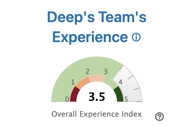
One of the hardest challenges we had while designing our UI was helping viewers understand if a metric is good or bad. We wanted to do that in a meaningful way that would indicate a sense of urgency and importance of a metric’s value. Our solution was to create a map between metric values and a developer’s perceived experience.
For example, we established that a local build time over 5 min is a really bad experience while a build faster than 10s is a great experience. We then created a scale between these extremes and assigned a metric an index from 0 to 5, with 5 representing a great experience. We called it the Developer Experience Index (EI) and it became a critical element of our product design. To compute an overall experience index for a team we average the values for each of the metrics. We found that a simple average of the experience indexes best matched what developers on the team were actually experiencing, based on development sentiment gathered via our developer productivity surveys.
Figure 1: Team’s Developer Experience Index gauge
This enabled us to have an apples to apples comparison of developer experience across organizations and better explain what metrics mean to all of our users. One important thing to note is that the developer experience index is an objective measure which doesn’t care about the status quo of a metric. In other words, it can highlight a poor experience even if that’s a norm or expected for that team.
We took extra care and consideration in the design of the UI and language around this feature to make sure it’s not being misinterpreted as a performance rating tool. The developer’s experience index is NOT a representation of developers' performance but rather their experience doing activities related to a metric.
Team Based Metric Aggregation and UI
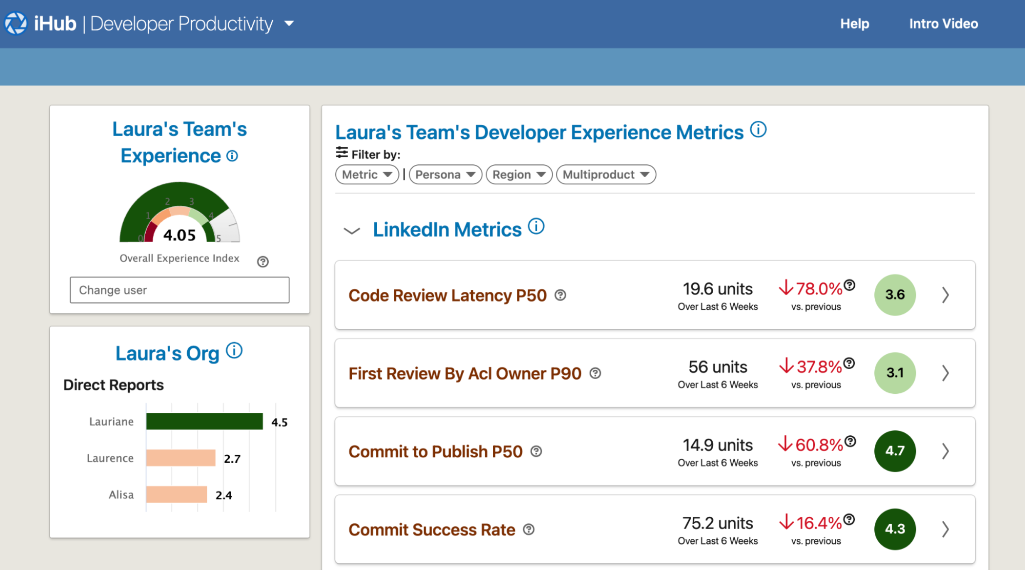
We aimed to address the challenge of fostering accountability among teams for their developer experience and metrics. To achieve this goal, we devised a solution where metrics were aggregated and presented on a team-by-team basis. For example, a developer’s build times are used to compute an overall Developer Build Time for her manager, the manager’s superiors. We found that users really connected with the team based metric aggregation.
Figure 2: Team’s landing page showing a list of relevant metrics and org based navigation on the left side bar (all data is mocked and some features are omitted)
Layering of Information
To reduce information overload, we hide most of the metric’s details until a user decides to dive deeper. When a metric component is expanded, we present insights (not shown), historical trend, and a dimensional breakdown of the metric. The dimensional breakdown is key in helping our users understand where a regression is stemming from. We provide employee Region, Persona (type of developer - e.g., frontend web, mobile, backend, etc.) and Multiproduct (a.k.a. repository) dimensions by default and support any other set dimensions that a metric may have.
Figure 3: An expanded metric detail view showing historical trend and dimensional breakdown (note all data is mocked)
Finally, we link to a dedicated dashboard for each metric with further slicing and dicing capabilities, and access to the individual data points. That is the final layer of information we wanted to present to the user.
System Architecture Overview
Setup
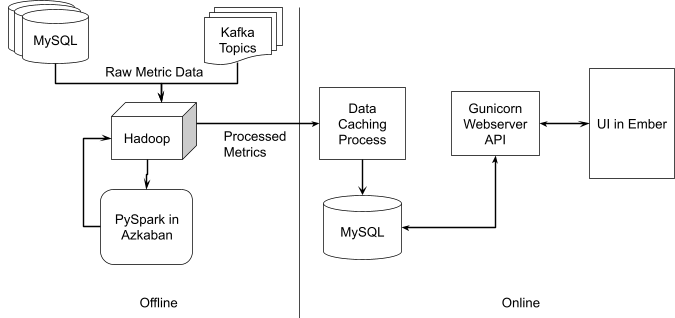
We wanted to build a single data processing pipeline that would be efficient and scalable as more metrics are added. The data needed to compute our metrics came from various sources including MySQL databases, Kafka topics and Hadoop (HDFS). We chose HDFS as our source data staging area because most of the other data sources at LinkedIn have a way to be exported into HDFS giving us a single access layer to all required data.
The team selected PySpark for the data processing and metrics computation as we were mostly a Python team. We decided to perform most of the metric computations offline to minimize any computation required at page load time.
Data Flow
We compute and load the full set of metrics from HDFS to a MySQL database every day and use a Gunicorn web server to serve it to the frontend. We are using Ember for our UI to leverage existing component libraries built internally.
Figure 4: High level data flow and system design
Scaling to Support Team Specific Metrics
Soon after the launch of our product we learned that our users also wanted to onboard their own metrics for a more complete picture of their developer productivity. Unfortunately, neither our data processing pipeline or the UI were designed to scale in such a way and we had to adapt.
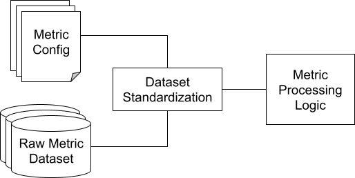
We wanted to create a data platform that allowed us to onboard new metrics with no code changes. We did that by separating the metric’s configuration logic (i.e. raw data path, column mappings, aggregation function to be used, etc.) from the metric’s processing logic (i.e. filtering, group by queries and value aggregations). We introduced a data standardization step that mapped a raw metric dataset into a standardized dataset that our metric processing logic would understand.
Here is an example of a metric configuration file that describes how a metric dataset should be processed.
Unset
---
data_path: database.my_metric_data
column_map: # mapping of your columns into those that we understand
 username: username_column # value representing a user associated with each datapoint
 value: my_value_column # value of your metric
 metric_name: my_metric_name_column
 custom_dimension: my_custom_dimension_column
---
my_metric_name:
 functions: # a list of functions to be computed for your data
   - p50
   - p90
 dimensions: # a list of dimension columns (after they are mapped).
   - custom dimension
 manager_visibility: # a list of ldaps representing top of the org structure under which this metric will be visible to. Default is our CEO
   - team_manager
Figure 6: Sample metric configuration that describes how a dataset should be processed
Adding team specific metrics to our UI made it busier and more difficult to understand. We wanted to preserve the focus and simplicity of the original experience while still enabling teams to organize their own metrics in a meaningful way.
Customer Success Stories
Since the outset of our efforts we established key partnerships with various engineering organizations welcoming them as early adopters. This fostered a close feedback loop and provided us with an initial group of committed users. Subsequently, after developing a Minimum Viable Product (MVP), we introduced it to those early adopters and continuously refined it based on their input. As a result of the MVP launch, the number of unique visitors (including managers and productivity champions) to iHub increased dramatically from 40 to over 200 within a single quarter. Nowadays, it’s visited by approximately 400 monthly unique visitors, comprising leaders and productivity champions from various engineering organizations.
Here are some of the success stories we’ve heard:
A senior eng manager from LinkedIn Marketing Solutions engineering team: “When I first heard about iHub it sounded like magic to me. How do you measure developer productivity and happiness in a simple way? So I gave it a try and picked a developer with a low Experience Index (EI) Score. I was surprised to learn that this developer was struggling because he was working on a legacy code base. So we did end up removing the tech barrier for him. Since then I kept an internal OKR for myself to maintain the EI for my developers above 3.5. I loved the fact that how the EI normalized the experience measuring and it’s so easy to drill down! You will be surprised to see the powerful conversations you can initiate from this tool with your developers and your teams!”
A senior manager from LinkedIn Trust engineering team: “In the past several months we have been piloting using iHub in our team ops review. iHub provides great visibility on productivity metrics. One example is by using iHub we are able to quickly identify that one repository takes longer to build than before. We further looked into the data and removed unused dependencies for this MP to improve the build time. What I love most about this tool is that it not only provides aggregated metrics on various org and team levels but also has the features to make the drill down so easy!
Closing Thoughts
We hope this post gives you a good understanding of how we approached the problem of measuring and presenting developer productivity and experience metrics at LinkedIn. Here are some key learnings from our journey:
Aligning on metrics’ design with our partners increased and sped up adoption.
Interpreting metric values takes time and mental cycles so providing an interpretation such as the Experience Index speeds up interpretation and provides a common baseline for comparison.
Metric dashboards can quickly become overwhelming and it is key to layer information to prevent mental fatigue and help users gain insights faster.
Teams have their own metrics they want to track alongside those at the company level and the data pipeline along with the UI must be able to support it. Otherwise, teams will be forced to create and manage their own metric dashboards.
It has been an exciting journey so far with many fun challenges along the way. We’re extremely grateful to be working at a company that recognizes the value and importance of such work and dedicates resources to making every engineer's life better.
Acknowledgements
This project would not have been possible without the contribution of so many of our colleagues and partners. Huge thanks to our partners from LinkedIn Marketing Solutions and Flagship Team.
Special shout out to the team members that helped bring this product to life: Chennan Li, Chris Carini, Ankur Mehta, Graham Turbyne, Grant Jenks, Max Kanat-Alexander, Deep Majumder, Vasantha Rao Polipelli.


