Creating a Flexible Android Widget
April 15, 2015
Background
At our weekly Android meetup at LinkedIn, after the release of the LinkedIn Today Widget for iOS 8, we decided to talk about Android's AppWidgets (commonly known as just widgets). Albert Lai, from Pulse, presented how their Android widget works, and how it drives a large number of app launches. I decided to read up on the capabilities of Android widgets again, since Jelly Bean added some features for resizing that really improved the quality of widgets that developers can make. This inspired me to create a widget for the main LinkedIn app that offered the same features as the new iOS 8 widget, but also took advantage of the fact that Android supports widgets of nearly any size.
A Flexible Widget
Android's widgets are very flexible, and can be designed to support many different sizes, but this flexibility requires a lot of work to get it right. Starting with Honeycomb MR1 users have been allowed to resize their widgets, and with the first release of Jelly Bean, the crucial ACTION_APPWIDGET_OPTIONS_CHANGED broadcast was added. This notifies the widget's AppWidgetProvider when its size has been changed by the user, and allows developers to alter the user interface based on this new size. Using the Android Widget Design Guidelines, you can also estimate the number of rows and columns your widget is taking up on the home screen, but this is not an exact science. My testing on various devices showed that not all launchers follow these guidelines exactly, including some default ones created by device manufacturers. These guidelines were still very useful when designing a widget that has multiple visual modes, each displaying varying amounts of information based on the widget size.
Full Size
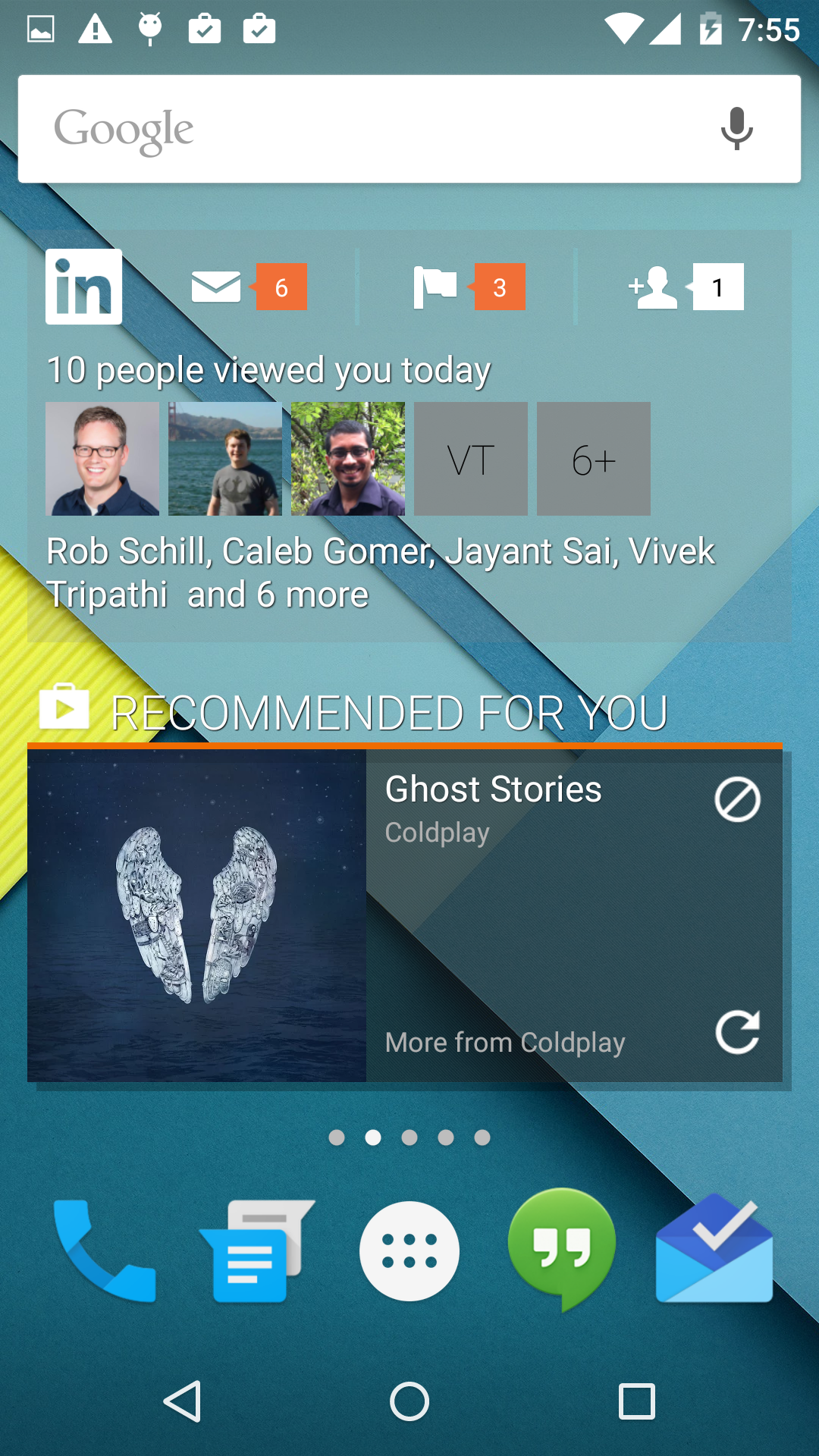
If the widget has been given a size of more than one row and two columns, it will display who's viewed you and three buttons which navigate into the Messages, Notifications, and Invitations sections of the app. If there is enough room (at least four columns), these buttons will also include individual notification counts related to their respective section, similar to the notification bar design inside the app.
Button Size
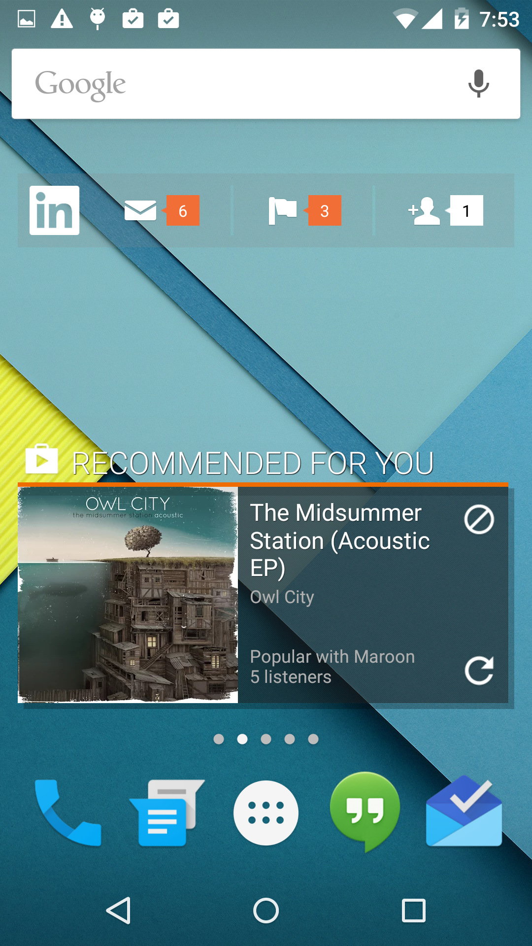
If the widget is shorter, with only one row, but has at least a width of three columns, the user will still still see the buttons, along with their notifications if there is room.
Icon Size
If the widget is given less room than this on the home screen, it will only display a basic app launcher icon and a notification badge, totalling all notifications for the app. This app icon notification badge is standard on the iOS platform, but most Android home screen launchers do not support it. With this new widget, any LinkedIn user on Android can check their notifications from the home screen, regardless of their choice of launcher.

Full Size

Buttons Size
Icon Size
Android Versions
While these resizing features give a lot of flexibility to users with newer phones, I wanted to preserve the same basic functionality on devices prior to Jelly Bean as well, since nearly a quarter of Android devices are running older versions of the operating system that do not support intelligent resizing (according to the Android Developer Dashboard in November 2014). To accomplish this, I created two additional fixed-size widgets, resulting in one for each of the three major sizes. All three can be added to the home screen on devices prior to Jelly Bean, but later devices will only display the single, resizable widget which offers the most flexibility.
Localization
Building an adaptable widget also included localization, which required translated strings both for the widget, and for the launcher for when the user chooses to add the widget to their home screen. Adding a widget to the home screen has changed dramatically since earlier versions of Android, like Gingerbread, even with the default Android launcher. For example, Gingerbread commonly displayed a list with only one item for each installed app, even if there were multiple widgets. Upon clicking this item, the user would see a new screen with the app's name, logo, and the list of widgets. However, Honeycomb and later versions rearrange this list into a grid, remove the app name and logo, and sort the grid based on the title of the widget. This means that widgets for newer devices need to prefix the widget name with the app name, "LinkedIn," or risk having each at completely different locations in the widget grid, leaving users to swipe through every screen to find multiple widgets from the same app. Adding "LinkedIn" to each widget title would also mean that older devices would see the LinkedIn logo, the LinkedIn app title, and "LinkedIn" at the beginning of the title of each widget. This is very redundant, and wastes a significant amount of screen space when trying to choose a widget. Furthermore, newer devices will only see a single widget, so simply using the app name is acceptable. For these reasons, the widget required a significant number of localized strings to adapt to so many languages and launcher configurations.
Sharing Code
When implementing the widget I was able to make use of our existing authentication, networking, image downloading, and deep linking components from the app to reduce code redundancy. I also quickly noticed that when implementing the two additional widgets there would be a lot of similarities, and I wanted to reuse my existing work instead of duplicating large portions of the layout files and code. I was able to accomplish this by using a single IntentService for updates, and by creating separate XML layouts for each major section, including them in each widget as needed. This made building the additional widgets for older devices extremely simple and clean. For example, to update the data and views of any type of widget, you would use this function:
Widget Updates and the Battery
Choosing when to update the data and views of the home screen widget is an important decision when designing the widget, since most of the time a user is not viewing their home screen. For example, when the screen is locked, or an app is open there is no way to see the contents of your home screen widgets.
Common Practice
Android widgets must specify an AppWidgetProviderInfo#updatePeriodMillis value in the widget's info file. This registers the widget for a recurring ACTION_APPWIDGET_UPDATE broadcast, notifying your widget to update its contents at the requested intervals.
Problems
Android will request an update whether or not the phone is actively being used. This leads to network and database requests to refresh data, even when the user cannot possibly see the changes, consuming battery life with no benefit to the user.
A Solution
The widget I designed attempts to conserve the phone's battery life by performing updates only when the user is actively using the device. By using information from KeyguardManager and ConnectivityManager, and listening for ACTION_USER_PRESENT broadcasts, the widget will only make expensive data requests when the phone is in use. Any update broadcasts that are received from the system when the phone is locked or sleeping will be deferred until a user unlocks the device.
What's Next
Building this widget was a fun experience because I was able to experiment a lot and learn more about Android widgets. It started as a one-day hack, but I was able to build it out and release it to all of our Android users, so I can't wait to see how many people find this widget helpful and to see how much engagement it will drive.
Acknowledgment
Thanks to Rob Schill for designing the assets and to Vivek Tripathi and Jayant Sai for all the feedback and suggestions.