Monitor and Improve Web Performance Using RUM Data Visualization
September 19, 2014
As a global company with web traffic from all over the world, optimizing web performance for different geographic locations is important for LinkedIn’s member engagement and experience. We capture Real User Monitoring (RUM) data from most of our web pages and mobile applications. A good visualization tool on top of the RUM data is essential for us to quickly understand what is affecting site performance. This article describes a tool/infrastructure, known internally as GoSpeed, that we built for this purpose. It provides RUM data processing, visualization, monitoring, and analyses data daily, hourly, or on a near real-time basis. GoSpeed also presents analysis results that indicate why site speed matters so much to member engagement. The results help us build a culture of site speed awareness on the engineering team.  Figure 1. GoSpeed data processing and visualization Infrastructure The diverse set of teams at LinkedIn means different teams need to look at the RUM data from different perspectives. GoSpeed breaks down data in different dimensions for various needs. For example, if we see a mobile page performance degradation in China, we can focus in to see which city, network carrier, or CDN provider has a problem, or we can look which code release version, OS platform has a problem. Canned reports or dashboards can be customized for different teams in the engineering, operations, and products organizations. GoSpeed also provides bounce rate and page view metrics. RUM data is also closely integrated with our experiment platform XLNT to show site speed metrics as well as engagement metrics. Visualization details are described in the following sections.
  Figure 2. Goal tracking for a page key in a country
 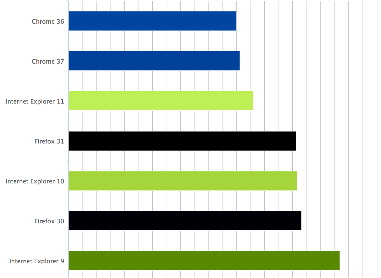 Figure 3. Browser performance comparison in a LinkedIn page
  Figure 4. Browser traffic share
  Figure 5. Select different dimensions in GoSpeed In the example of Figure 6, the chart shows why a page load time has improved since July 1. By plotting page median page load time (black line) from Navigation Timing, image request average counts (blue line) and each image’s average download time (green line) from Resource Timing together, we can then see that the optimization to reduce page weight on images contributed to better page load time performance.
 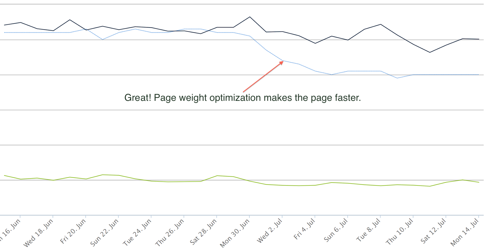 Figure 6. Example of metrics comparison and correlation
 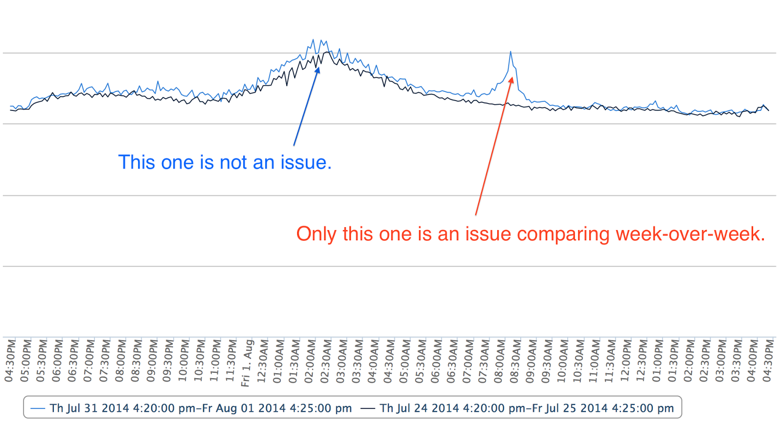 Figure 7. Week-over-week overlay chart
 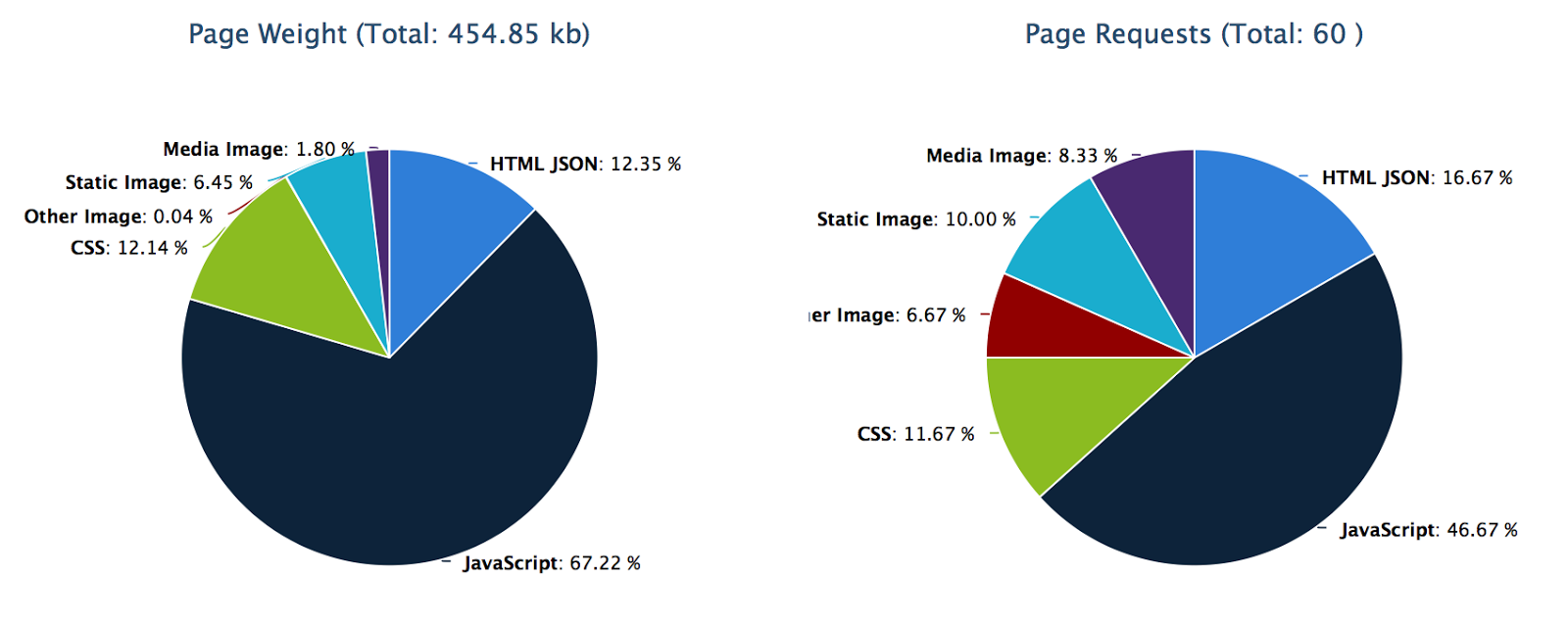 Figure 8. Page weight breakdown
 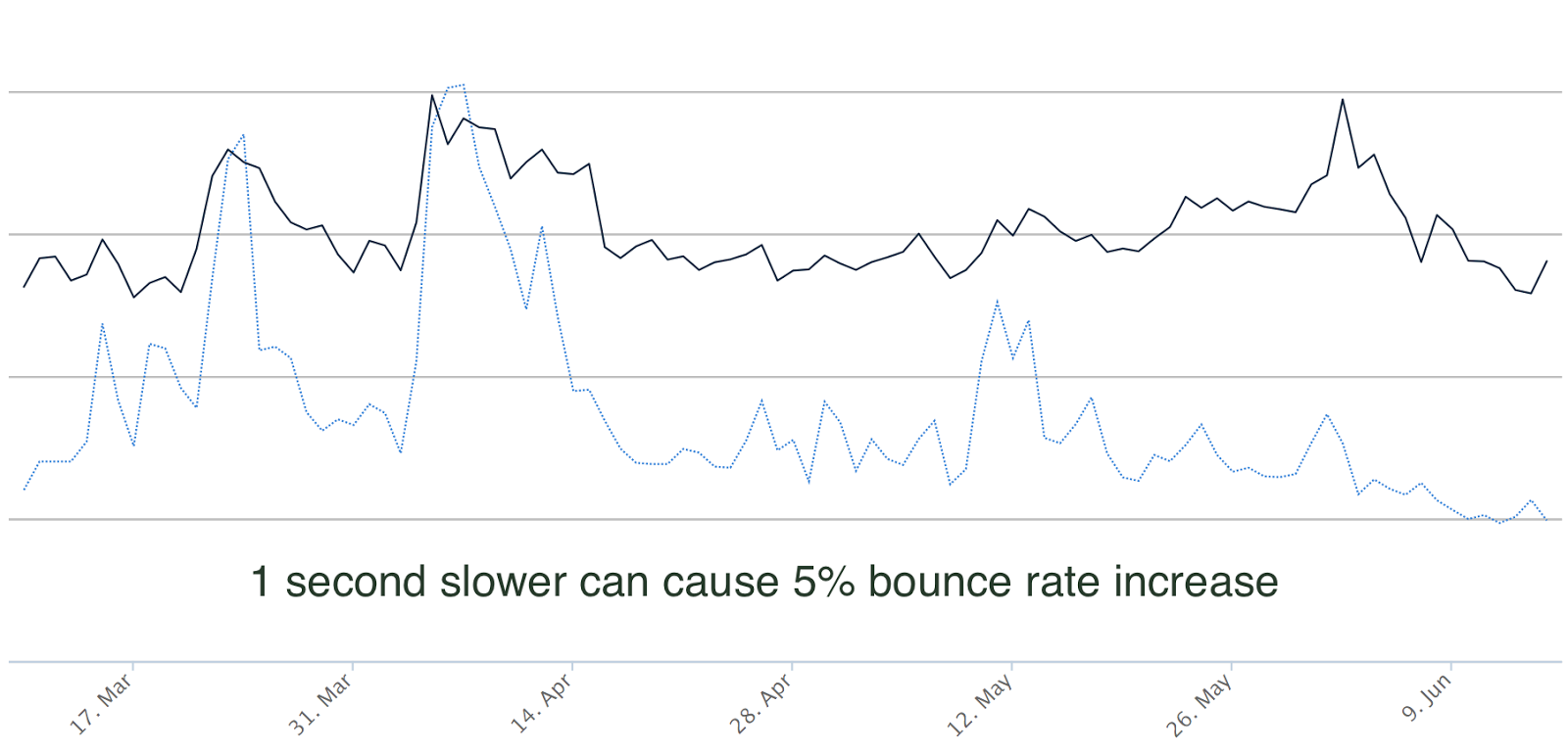 Figure 9. Correlation between page load time and bounce rate
 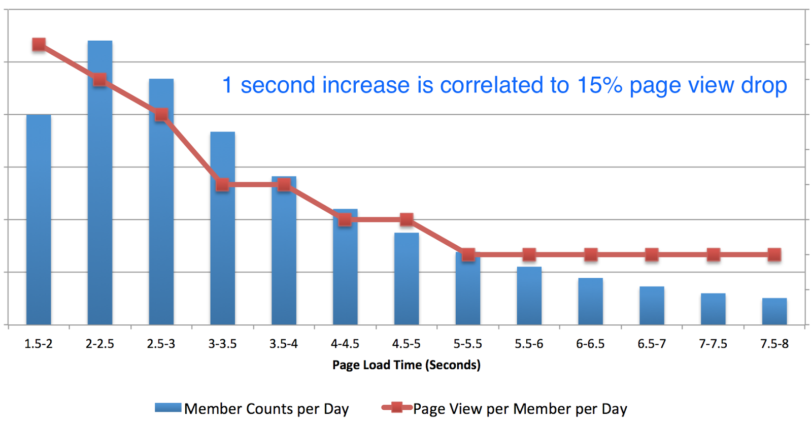 Figure 10. Correlation between page load time and page view in the US
Data Processing and Visualization
What Data to Collect, Process, and Visualize
In RUM, basic metrics from Navigation Timing and Resource timing in web browsers are collected through JavaScript using the open source Boomerang library. Mobile performance markers are collected by mobile applications. As shown in Figure 1, these metrics and markers are sent back from clients through RUM beacons. We use a Kafka messaging system to collect raw data. In GoSpeed, the raw RUM data is then preprocessed in Hadoop clusters for daily or hourly aggregation using Pig scripts, and in the Samza stream processing framework for real-time aggregation using Java. The aggregated results are inserted in a relational database; therefore, query and visualization for analysis and monitoring are fast. Figure 1. GoSpeed data processing and visualization Infrastructure The diverse set of teams at LinkedIn means different teams need to look at the RUM data from different perspectives. GoSpeed breaks down data in different dimensions for various needs. For example, if we see a mobile page performance degradation in China, we can focus in to see which city, network carrier, or CDN provider has a problem, or we can look which code release version, OS platform has a problem. Canned reports or dashboards can be customized for different teams in the engineering, operations, and products organizations. GoSpeed also provides bounce rate and page view metrics. RUM data is also closely integrated with our experiment platform XLNT to show site speed metrics as well as engagement metrics. Visualization details are described in the following sections. Heat-Map
This visualization view provides products, operations, and executive teams a quick overview of latency distribution across the world using a colored picture map. If a country is of interest, the country can be selected to see a city/state level heat-map.Goals Tracking
We set goals to improve site speed in yearly or quarterly intervals depending on available optimization methods and resources. GoSpeed provides a canned report for teams to quickly check where they are against their goals. Figure 2 shows that at the beginning of the year we set to improve page load time 40% for a page in a specific country by the end of Q3 2014. Each week we expect some incremental progress, with 40% slower than the goal at start of the year, and 0% difference at the end of Q3. As shown in Figure 3, blue line is the expectation, and black line is the actual progress for a given week. We can quickly know from the chart that this page was in good progress from January to June. Figure 2. Goal tracking for a page key in a country Web Browser Breakdown
Browser traffic share and browser performance are useful sources for us to do browser-specific optimizations. As RUM data contains user agents with browser information, we are able to process and visualize the details. Figure 3 shows page load time differences in browsers for a selected page; Chrome is more than 30% faster than IE 9 for this page. Figure 4 shows traffic shares for different browsers. Figure 3. Browser performance comparison in a LinkedIn page Figure 4. Browser traffic share Compare Metrics in Different Dimensions
In many diagnostic or analytic cases we need to slice and dice the data in a way that we can dive deeply to specific issues. In GoSpeed, we provide preprocessed aggregation data so that our internal teams can compare different metrics in different dimensions quickly. Figure 5 shows the UI example of dimension selections provided in GoSpeed. Figure 5. Select different dimensions in GoSpeed In the example of Figure 6, the chart shows why a page load time has improved since July 1. By plotting page median page load time (black line) from Navigation Timing, image request average counts (blue line) and each image’s average download time (green line) from Resource Timing together, we can then see that the optimization to reduce page weight on images contributed to better page load time performance. Figure 6. Example of metrics comparison and correlation Real-Time Visualization
To catch problems or monitor new feature releases timely, GoSpeed data is available in near real time. Samza, an open source infrastructure built by LinkedIn, is used for RUM data aggregation processing in 5 minutes intervals. In Figure 7 we can see page load times are up at 2:00am and 8:00am on a page on August 1. To identify which one is a real issue, week-over-week overlay visualization is provided, with blue line as current week and black line as last week. We can see the 2:00am up-trending is because of natural traffic related performance patterns happening at a same time last week during the same hour, while the 8:00am spike is a real problem. We then plot server side related metrics and find that this is server side issue. Figure 7. Week-over-week overlay chart Page Weight Correlation
In addition to RUM data, GoSpeed provides visualization for page weight data from synthetic tests to correlate RUM metrics to page weight. Page weight data is collected daily through HTTP Archive (HAR) files by Selenium real browser tests on our production pages. Page weight and RUM correlation provides good insight toward locating optimization opportunities. Figure 8 shows content type and request breakdown in a page. We can also plot the trending of RUM metrics and page weight metrics together to easily show any correlations. Figure 8. Page weight breakdown Site Speed Monitoring
GoSpeed charts help us easily examine RUM data from different perspectives; we can identify many optimization opportunities, and catch issues quickly. However, LinkedIn moves fast. There are can be hundreds of changes on the site per day. If everything requires manual human investigation, we would miss a lot of performance issues. So we built a monitoring system using GoSpeed data and a comparison rule engine, to proactively capture and alert people. This site speed monitoring system is built in an intelligent way that can filter false positive noise. Alerts are sent through email to related teams. Links of the monitoring system and GoSpeed are attached in the alert email so that we can quickly visualize a specific issue, and do a deep dive into analysis details manually using the visualization described in previous sections.Degradation Detections and Alerts
Traffic patterns on LinkedIn vary with relation to the professional’s work day. Traffic is different for work hours and off-work hours. Server load and CDN cache utilization are different. Therefore, page load times for a same page can also differ depending on the time. To compare the performance difference between baseline and current, we consider these traffic patterns. We use a same hour, same day, and week-over-week comparison. To make baseline more stable, we use the average latency of the same weekday over the last four weeks as the baseline. A threshold is defined for each page and GEO location. An alert is triggered if the degradation is above the threshold. These alerts allow us to catch many site performance issues quickly and efficiently.Early Integration
We typically ramp up new features gradually, starting with employees, then to a small percentage of members, then larger percentage of members, and finally full roll-out. Our A/B test framework is used during feature ramp-up. During each step of ramp up, GoSpeed data is integrated as part of site health check in our site speed monitoring system. If any ramp-up causes a slow down beyond a certain threshold, we will alert related teams and feature owners. This automated check helps us detect degradation in real-time when a feature is ramped up.Site Speed Data Analysis
Several real use cases are presented to show how we use RUM data and visualization provided by GoSpeed to analyze performance, and engagement correlation. These results helped us to make important decisions to make our site better.Page Load Time and Bounce Rate
Bounce rate represents the percentage of visitors who enter the site and leave the site rather than continue viewing other pages. There are many factors that can affect bounce rates, such as page design or page performance. We track bounce rates for key entry pages in GoSpeed. By plotting site speed metrics and bounce rates together, we can see a correlation. Figure 9 shows an example of page load time and bounce rate for a landing page in a country. The black line is page load time, and blue line is bounce rate. The chart shows a strong correlation that if page load time is slower, bounce rate is higher. From various data points we can conclude that if the page load time is 1 second slower, the bounce rate increases 5%. Figure 9. Correlation between page load time and bounce rate Site Speed and Engagement
We used RUM data to do an analysis of member engagement correlation by looking at page view and page load time distribution. Figure 10 shows that in the US, page view per member per day is highest when page load times are less than 2 seconds. If page load time increases 1 second, page views per member drop 15% (or 100ms page load time increase causes 1.5% page view drop). After page load times slow more than 5 seconds, page views hit their minimum and become flat. From this data, we have targeted 2 seconds as our goal to drive the best member engagement. Figure 10. Correlation between page load time and page view in the US