In a previous post, we discussed how we Visualize LinkedIn's Site Performance. In this post, you'll learn about the software behind our visualizations, called inGraphs, and meet Eric Wong, who created inGraphs when he was an intern.

Flash back to Summer 2010. I came to LinkedIn as an intern in Site Operations. To get me started, I was given the task of setting up metric collection in an open source tool called Zenoss. Every service that makes up LinkedIn has a variety of metrics that can be tracked to provide insight on site performance. Getting data from Zenoss required digging through a slow web interface, so I wrote some python scripts to help streamline the process. While there was still manual intervention in setting up metric collection, I was able to cut down the time spent navigating Zenoss' interface.
About a month and a half passed and data was being collected from all of the services responsible for the site, but there was a problem. The data was not easily accessible. What's the point of collecting so much data if it was going to sit on a disk never to be looked at? Zenoss was simply too slow and limited to be able to provide useful access to the data. To get something as simple as CPU usage of all the hosts running a particular service, you would need to file a ticket and someone would spend 30 minutes putting it together. We needed a faster process to access the data. This gave birth to my next project: inGraphs.
inGraphs was intended to be a frontend to the round-robin database (RRD) files that Zenoss dumped the data to. The main requirements were that it needed to allow anyone to access the data and allow them to customize what they saw. After spending a day or two with python, HTML, and JavaScript, I was able to get a working prototype up and running.


Example of the visualizations inGraphs can produce
From there, I continued to add features to give the users the ability to see exactly what they wanted. By the end of the summer, users were able to make calculations across multiple datasets using RPN expressions, view week-over-week trending to compare historical performance, and even define custom dashboards to pick exactly which metrics would be displayed on a single page.
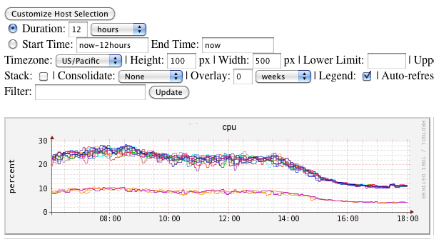
Some of the customization options for inGraphs
It took me completely by surprise to see how quickly inGraphs had spread throughout the company, and it wasn’t long before I was seeing it on wall-mounted TVs across the various engineering groups. Whenever inGraphs was mentioned, you can bet my nickname, “Eric the Intern,” was soon to follow.
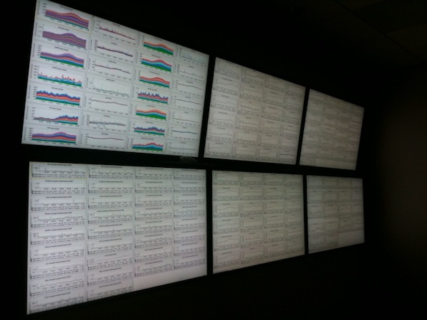
Six 40" TV's with inGraphs from across LinkedIn
Fast-forward to the present day. I’ve since graduated from Berkeley and joined LinkedIn as a full-time employee. It was due to LinkedIn’s agile culture and faith in its interns that allowed me to be successful, and I’m excited to see the next big thing from an intern that will relieve me of my title.